Our UOC brand
The soul of the UOC
At the heart of our brand lies our purpose as a university, the reason why we're here:
To make quality higher education accessible and empower people to transform their lives and the world around them.
This purpose defines who we are – an open, inclusive university designed for every stage of life – and what we do: create opportunities for lifelong growth, offering learning pathways to match each person's aspirations and circumstances.
Based on this premise, our mission and vision define what we do and how we go about fulfilling our purpose.

Mission
We generate, transfer and connect knowledge to build a more critical, responsible and nonconformist society.
Vision
Understanding our environment and leading research in our educational model, we offer groundbreaking methodologies that strengthen and develop diverse talents.
A UOC open to the future
This purpose is manifested in our slogan "Open to the future", which expresses both our identity and our intentions, the tangible horizon of a university that not only adapts to changes but unlocks them and leads them.
At the UOC, we don't wait for the future to arrive; we anticipate it and play an active part in configuring it.
- Logo
- Colours
- Typography
- Icons
- Photography
- Illustrations
Logo and system
Going beyond
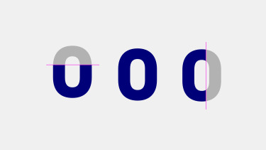
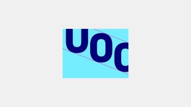
At the UOC, we are able to adapt to different environments and needs. The logo’s framing emphasizes there is more happening beyond the limits of the screen.
Diagonal design
As if by good luck, with the diagonal design, the 0 can be made into an O, a U or a C depending on how it is framed.
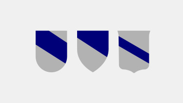
Heraldic shields
This diagonal design evokes the diagonals seen on classic university shields; it creates dynamism, while harking back to heraldry.
Logo: a responsive system
One of the essential characteristics of brand behavior is adaptability. The logo supports three versions, which can be used interchangeably, depending on the delimitations of the space.
Corporate and secondary range of colours
The mainstays of our brand are the two corporate blues. The UOC's light blue is joined by four other colours to make up the main palette, and the dark blue is the common denominator across all applications, used for text. To supplement this, there is a secondary palette of pastel colours and a palette of greys, less bright and more natural. All these colours reflect the UOC's digital environment and have been chosen for this setting.

UOC typeface
Two corporate font families have been created based on the logo. Both maintain and strengthen the spirit of the graphic design, are very legible on digital devices, and provide consistency across our communication channels.
UOC Serif
UOC Serif has a clearer contrast that makes it more elegant when used in larger font sizes.

UOC Sans
UOC Sans is a contemporary sans serif typeface. Its compactness and simplicity make it highly versatile.
Icon style
We have created a set of icons styled upon the logo, a visual resource that adds to the idea of going beyond the limits of the screen.
The characteristics of our icon style are:
- thick single lines
- geometric depictions
- cut-off on one of each pictograms' four sides
- minimalist concept

Photographic style
To balance the new visual system and the colour palette, the photographic style is based on images that are clear, clean and warm.
People are intrinsic to the UOC, and they are therefore a key part of the photographic style. Our photos must be natural, not forced or superficial, and even somewhat casual.
As an active university, we should use photos of people concentrating on doing their work.

Illustration style
The illustrative style is part of our visual language and helps us project a consistent, recognizable identity. It is based on the same graphic principles that define our style: simple shapes, clean strokes, and consistent line weights. This language allows us to create characters and scenes with a synthetic, approachable, and contemporary style that aligns with our brand.